Tuesday, April 19, 2022

Cover Art for Alfred Hitchcock Books, Part 3


This is the third and last week I'm looking at the cover art for Alfred Hitchcock mysteries, though I will come back another time to revisit these collections in terms of actual content. This week, we look at Hitchcock as a highly recognizable pop culture figure. The director's spooky, disturbing films, his dry sense of humor as a television presenter, and his somber suits all suggested a strange personal life (The wildly popular television show "Dark Shadows," at one time contemporary with "Alfred Hitchcock Presents," did the same thing to actor Jonathan Frid.)

And of course each episode of "Alfred Hitchcock Presents" began with the greeting "Good evening."  Where had we heard that before?  Oh yeah...


Perhaps, viewers and readers thought, Hichcock might possibly have done dark magic or slept in a coffin...


Obviously, then, someone like this would hang around with criminals and weird, dangerous people. Or things that resemble people.


Te following title is funnier if you know it comes from the cheery lyric "boys and girls together" in the song "Sidewalks of New York."


,
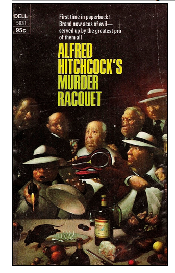
This next title drives me cuckoo because the spelling out to be "racket." Or else the cover art ought to match the spelling they used and then this one could go with the games theme we looked at last week.


Even people who never spent a moment speculating about what kind of person Alfred Hitchcock was certainly knew what Hitch looked like. The director's physical appearance made an impact on TV viewers. For one thing, he was a portly gentleman. 


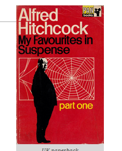
Hitchcock's facial profile was instantly recognizable, and was used each week in the television show's opening. As the theme music ended, Hitch's shadow came forward to align with a minimal caricature. 


We'd know that face anywhere.


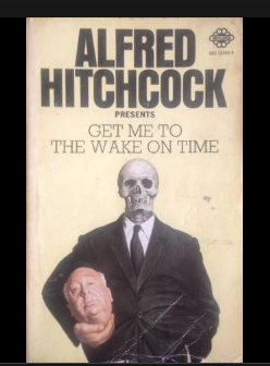
The famous-profile took on a whole new dimension with the many covers in which Hitchcock's head is separated from his body.


Why did so many paperbacks have Hitch separated from his head? Well. that distinctive profile was a factor. And I suspect it was also because in those pre-Photoschop days, the old Ichabod Crane effect  could be done with cut and paste artwork.


 I particularly like the muffin tin one, though of course a baker's dozen is thirteen and not eleven.


To finish off  this three-post series on Hitchcock paperback cover art, I want to say a quick word about titles.  Some are better than others, some are meant to be funny and aren't, some are social commentaries  which have gone out of date. My favorites for some reason are the titles which begin "Tales to..."


 I'll conclude with my favorite title pun.


Next time: Nothing about Alfred Hitchcock!


No comments:

Post a Comment